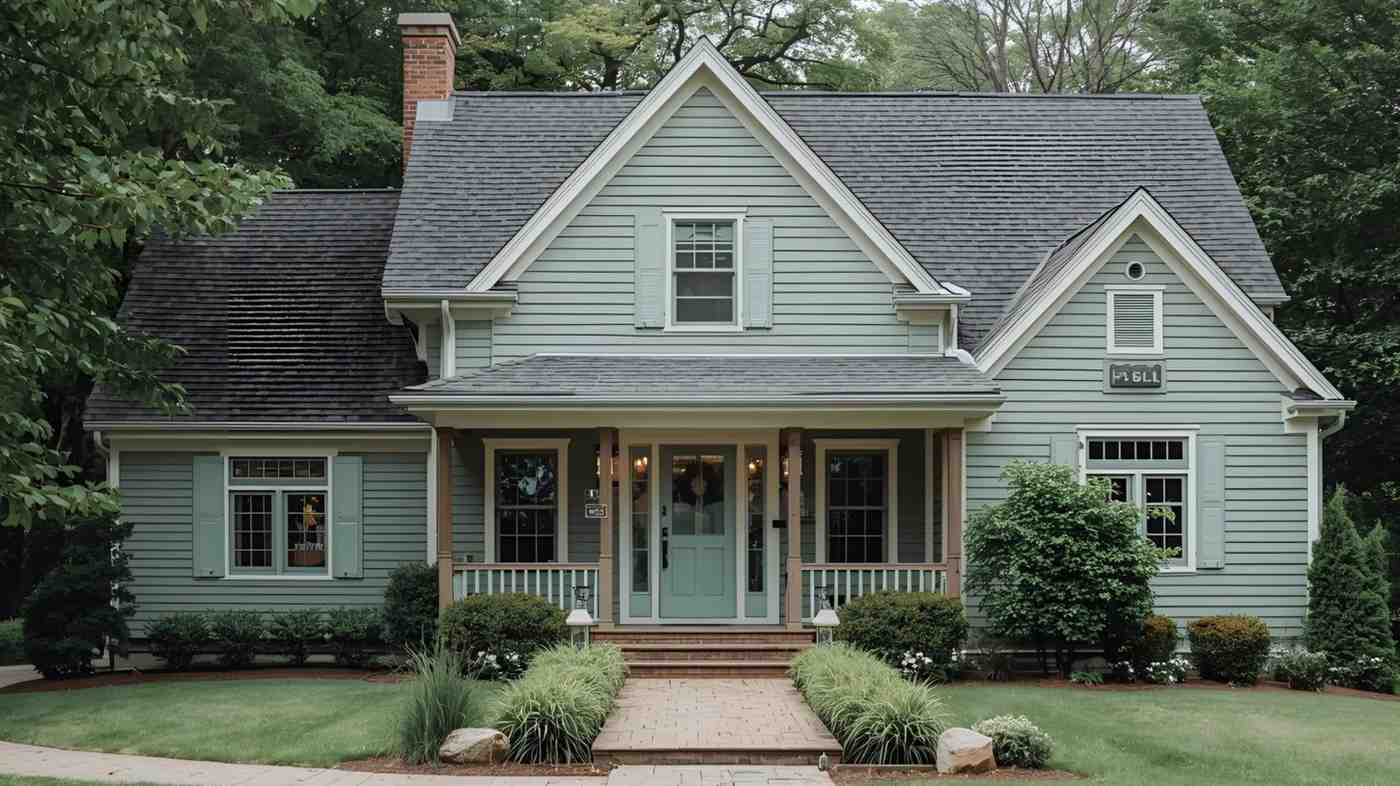
Picking the right paint color can feel overwhelming, especially when comparing two similar shades like Accessible Beige and Revere Pewter.
These two colors have become favorites among homeowners, and for good reason – they both offer a warm, welcoming feel to any room.
But how do you choose between them?
In this post, we’ll look at what makes each color special, from their subtle color differences to how they change throughout the day in different lighting.
We’ll compare their light reflectance values (LRVs) and help you understand which one might work better in your space.
Let us make your paint choice easier!
What is Accessible Beige?

Accessible Beige (SW7036) by Sherwin Williams has become an easy, no-brainer for many homeowners who want a warm, soft color that works well with many styles.
Let’s look at what makes this paint color so special.
Overview and Characteristics
Accessible Beige is a warm, neutral paint color by Sherwin Williams. It sits right between beige and greige, making it a perfect blend of cozy and modern.
Many people love it because it’s not too dark or light – it hits that sweet spot that makes rooms feel comfortable and inviting.
This color works well with both traditional and modern decorating styles, which helps explain why it’s such a popular choice.
Undertones and Lighting Effects
The magic of Accessible Beige is in how it changes throughout the day.
In bright natural light, it shows off its warmer beige side. But when the light dims, you might see more gray coming through.
South-facing rooms bring out their warm qualities, while north-facing rooms can make them appear cooler and grayer.
This flexibility makes it work well in different spaces.
What is Revere Pewter?

Revere Pewter (HC-172) by Benjamin Moore stands out as a balanced neutral that brings warmth and comfort to any room.
Let’s take a look at what makes this paint color so special to many homeowners.
Overview and Characteristics
Revere Pewter is a light greige color by Benjamin Moore that brings together the best of gray and beige.
It creates a cozy feeling without being too warm or too cool.
This balanced color works well in both small and large spaces, making rooms feel open yet snug.
It’s become a favorite among homeowners because it pairs well with most furniture and decor styles.
Undertones and Lighting Effects
Watch how Revere Pewter puts on a show as the light changes.
In morning light, you might catch hints of green. By afternoon, it can look more beige, while evening light brings out its gray side.
The color stays true to itself in both natural and artificial light, which makes it reliable for any room in your house.
In bright spaces, it feels light and fresh, while in darker rooms, it creates a soft, calming effect.
Revere Pewter vs Accessible Beige: A Side-by-Side Comparison

We put these two popular paint colors next to each other to see how they stack up.
This should help you spot the small but important differences between them.
Color Characteristics
While both colors give off a warm feel, they each have their own personality.
Accessible Beige stays true to its name with a soft, warm base that makes spaces feel cozy.
It often shows its beige side more clearly.
On the other hand, Revere Pewter sits right in the middle between gray and beige, creating a balanced look that many people love.
Both colors work well in most rooms, but each brings its own special touch to your walls.
Light Reflectance Value (LRV)
The numbers tell an interesting story here.
Accessible Beige has an LRV of 57.82%, while Revere Pewter comes in at 55.78%. T
his small difference means Accessible Beige reflects slightly more light, making it appear a touch brighter.
In small rooms or spaces with less natural light, this slight difference could make Accessible Beige feel more open and airy.
Revere Pewter, being just a bit darker, might create a more grounded feel.
RGB and CMYK Values
For the technical minds out there, here’s how these colors break down:
Accessible Beige:
- RGB: 204, 196, 184
- CMYK: 0, 4, 10, 20
Revere Pewter:
- RGB: 198, 193, 183
- CMYK: 0, 3, 8, 22
These numbers show why Revere Pewter appears slightly darker and more balanced between warm and cool tones. While Accessible Beige has that extra touch of warmth in its makeup.
How They Look in Different Lighting

Understanding how these colors change in different light conditions will help you make a better choice for your space.
Here’s how both perform throughout your home.
North-Facing Rooms
In north-facing rooms, where the light tends to be cooler and less direct, these colors show their true differences.
Accessible Beige maintains its warmth but can look a bit softer and more muted.
Its beige base helps balance out the cool northern light.
Revere Pewter might show more of its gray side in these rooms, creating a cooler feel.
If you want to keep the space feeling warm in northern light, Accessible Beige might be your better pick.
South-Facing Rooms
South-facing rooms get lots of warm, bright light throughout the day.
Here, both colors really shine but in different ways.
Accessible Beige gets brighter and warmer, showing off its sunny side. The strong light brings out its creamy notes.
Revere Pewter stays more stable but still warms up nicely – it won’t feel too hot or bright even in strong sunlight.
The balanced nature of Revere Pewter helps it stay true to its greige roots even in bright spaces.
How Artificial Lighting Affects the Colors
Different types of artificial light can change how these colors look in your home:
- LED Cool White: Makes Revere Pewter look more gray and can bring out subtle green notes. Accessible Beige stays warmer but might look a bit more muted.
- Warm White Bulbs: Bring out the best in Accessible Beige, making it feel extra cozy. Revere Pewter warms up too, but keeps its balanced look.
- Traditional Incandescent: Both colors look warmer and more yellow. Accessible Beige can get quite warm, while Revere Pewter maintains more balance between warm and cool tones.
Best Uses for Accessible Beige and Revere Pewter
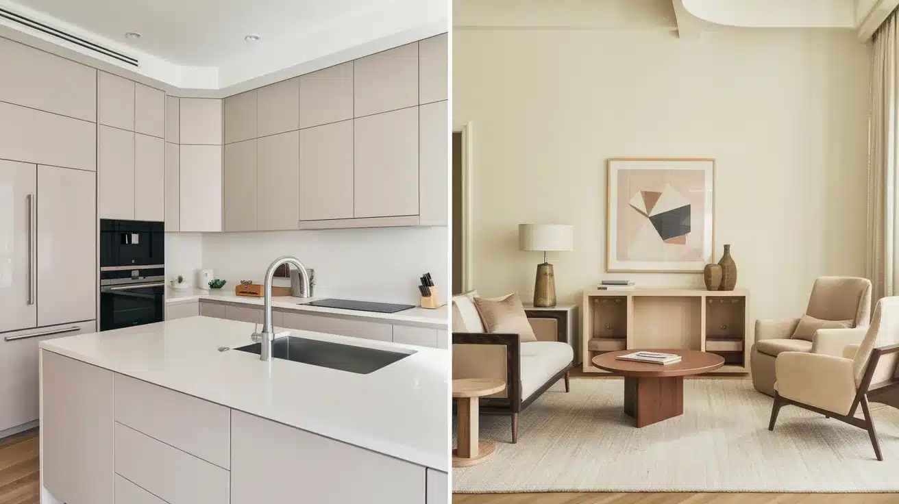
Let’s look at where each color works best in your home and how to match them with your stuff.
This will help you pick the right one for your space.
Which Color is Better for Which Spaces?
Accessible Beige shines in spaces where you want a soft, warm feel. It’s great for:
- Living rooms, where it creates a cozy spot for family time
- Bedrooms, adding warmth without being too dark
- Open floor plans, where it flows nicely from room to room
- Small spaces, since its higher LRV helps brighten things up
Revere Pewter works well in:
- Kitchens, where it adds warmth but stays clean-looking
- Home offices, creating focus without feeling cold
- Bathrooms, where it pairs well with both white and cream fixtures
- Hallways, making transition spaces feel put-together
Pairing with Furniture and Decor
Accessible Beige pairs well with:
- Dark brown or espresso furniture for a nice contrast
- White trim and cabinets
- Natural materials like jute, bamboo, and light woods
- Blues and greens for accent colors
- Gold or brass metals
Revere Pewter works great with:
- Both light and dark wood tones
- White or off-white trim
- Black metal accents
- Natural stone
- Deep blues, rich greens, or warm reds as accent colors
- Silver or nickel finishes
Key Differences

Let’s sum up what makes each of these colors special and help you decide which one might work better in your home.
The main things that set these colors apart are their basic personalities.
Accessible Beige brings more warmth with its beige base, making spaces feel extra cozy.
Its higher LRV (57.82%) means it reflects more light, helping rooms feel a bit brighter.
This makes it great if you want a warm, bright space that feels open and welcoming.
Revere Pewter, with its LRV of 55.78%, stays more balanced between warm and cool.
It doesn’t lean as much toward the beige side, which means it can handle bright spaces without getting too warm.
This balance makes it more adaptable to different lighting situations.
Conclusion
Both Accessible Beige and Revere Pewter are amazing paint colors that can make your home feel just right.
Accessible Beige offers that extra touch of warmth and brightness, perfect if you want a cozy space that still feels open.
Revere Pewter brings balance with its perfect mix of gray and beige, making it super flexible for many rooms and lighting situations.
The best pick for you will depend on your room’s lighting, your style, and the feeling you want to create in your space.
Take your time to test both colors on your walls – watch them change from morning to night.
Trust your gut feeling about which one makes your house feel like a home!