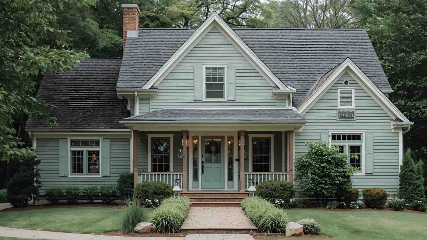
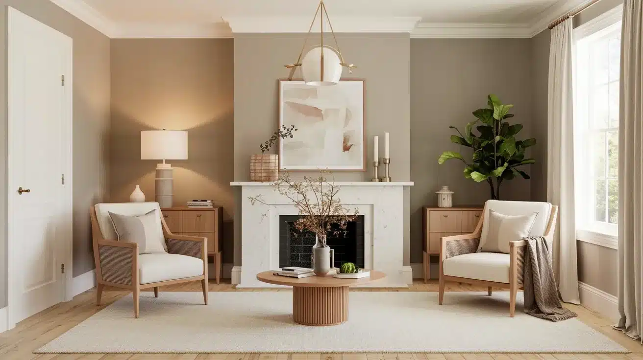
Paint colors can make or break a room’s feel, and Benjamin Moore’s Revere Pewter (HC-172) stands out as one of the most popular warm gray options available.
Many homeowners love this paint color because it creates a cozy, welcoming atmosphere in any room.
But what makes this color so special? It’s all about the undertones – those subtle color hints that show up in different lighting.
Understanding these undertones helps you know if Revere Pewter will work in your home.
Let us help you look at why this warm gray shade has become a go-to choice for both home decorators and professional designers and how its undertones play a big part in its success.
Understanding the Undertones of Revere Pewter
Before you put any paint on your walls, it’s helpful to know how it will look in your space.
With Revere Pewter, the magic lies in its undertones.
These subtle color shifts can make the paint look different as the light changes throughout the day.
What are Paint Undertones?
Think of undertones as a paint color’s hidden personality. They’re the subtle hints of color that show up when light hits the paint.
Just like how coffee can taste slightly fruity or nutty, paint colors have these small hints of other shades mixed in.
When you know about undertones, you can better predict how a paint color will look in your home’s lighting and if it will match your furniture and decor.
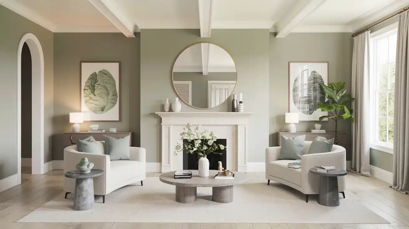
The Green Undertones of Revere Pewter
Revere Pewter shows its true colors with a gentle mix of green and gray.
This blend makes it feel warm and natural, like stones found near a garden path.
In morning light, you might notice more of the green coming through, while evening light brings out the gray tones.
This mix helps the color feel fresh but not cold, making your rooms feel more inviting.
Revere Pewter in Different Lighting
Light plays a big role in how this paint color shows up on your walls.
The same paint can look quite different from morning to night, making it important to test it in your specific space.
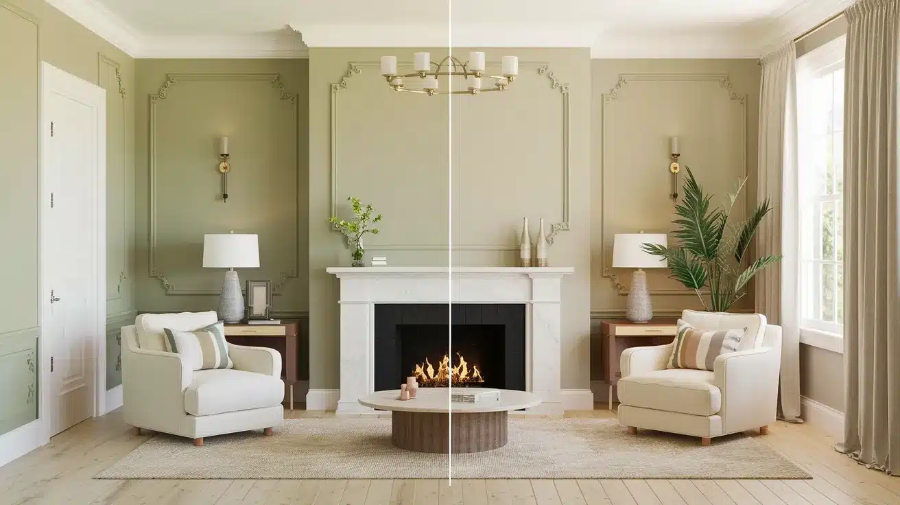
The Role of Lighting in Revealing Undertones
Your room’s lighting shapes how Revere Pewter looks on your walls.
In bright sunlight, it appears lighter and warmer, giving off a soft, welcoming feel.
North-facing rooms get cooler light, which brings out more gray tones in the paint.
South-facing rooms get warm sunlight, making the walls feel cozier and bringing out warmer tones.
If you use artificial lights, warm bulbs make the paint feel more inviting, while cool-toned bulbs highlight the gray aspects.
Common Mistakes to Avoid with Revere Pewter
Some rooms might not show this paint at its best.
- In spaces with very little natural light, the color might look darker than you want.
- Basements and small rooms with one window might make the green tints show up more than expected.
- It’s best to skip this paint in rooms that already feel cool – like bathrooms with blue tiles or spaces with lots of gray furniture.
Try painting a test spot and checking it at different times before doing the whole room.
Revere Pewter vs. Similar Paint Colors
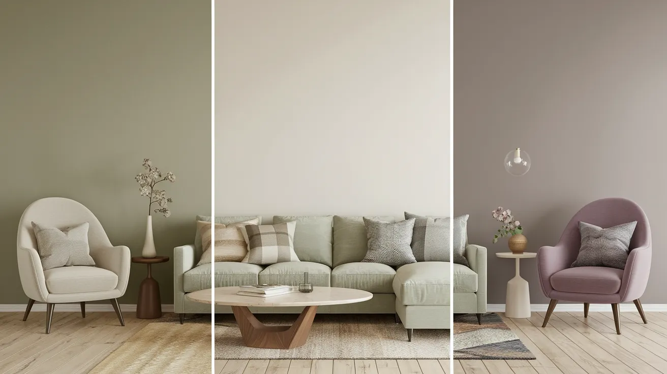
When choosing paint colors, it helps to look at similar options side by side.
This lets you spot the small differences that make each color unique and find the perfect match for your space.
Revere Pewter vs. Agreeable Gray
While both are popular gray paints, these colors have key differences.
Revere Pewter has green hints that make it feel natural and earthy.
Agreeable Gray feels warmer, with brown tints that give it a softer look.
In bright rooms, Revere Pewter shows more of its green side, while Agreeable Gray stays more neutral.
If you want a color that feels more like nature, go with Revere Pewter. For a warmer, more neutral look, Agreeable Gray might work better.
Revere Pewter vs. Collingwood
These colors might look alike at first glance, but they act differently on your walls.
Collingwood brings purple hints to the mix, making it feel cooler and more modern.
In contrast, Revere Pewter’s green tints create a more natural, classic feel.
Collingwood works well in spaces where you want a crisp, clean look, but Revere Pewter adds more warmth to a room.
Morning light makes these differences most clear – Collingwood stays cool while Revere Pewter warms up.
Best Pairings for Revere Pewter
Getting the right color combinations can make Revere Pewter look even better in your home.
The key is picking colors that work well with its warm gray base and green hints.
Complementary Trim and Cabinet Colors
White Dove makes a perfect trim companion for Revere Pewter – it’s soft and warm without being too stark.
Simply White offers a brighter option that still feels natural and clean.
For cabinets, Cloud White adds subtle warmth that matches well with Revere Pewter’s green hints.
The trick is choosing whites that don’t feel too bright or cold – you want them to feel as cozy as your wall color.
Suitable Wall Colors and Finishes
For walls, an eggshell finish brings out the best in Revere Pewter – it hides small marks while adding a soft glow.
If you’re painting different rooms, Gray Owl makes a nice partner in bathrooms or bedrooms where you want a slightly cooler feel.
For living spaces next to Revere Pewter rooms, Pale Oak offers a lighter option that keeps the flow going.
Semi-gloss works well for any trim, making the whites pop against the main wall color.
When to Choose Revere Pewter for Your Home
Picking the right spots for this paint color can make a big difference in how your home feels.
Let’s look at where Revere Pewter works best and why.
Ideal Rooms and Spaces
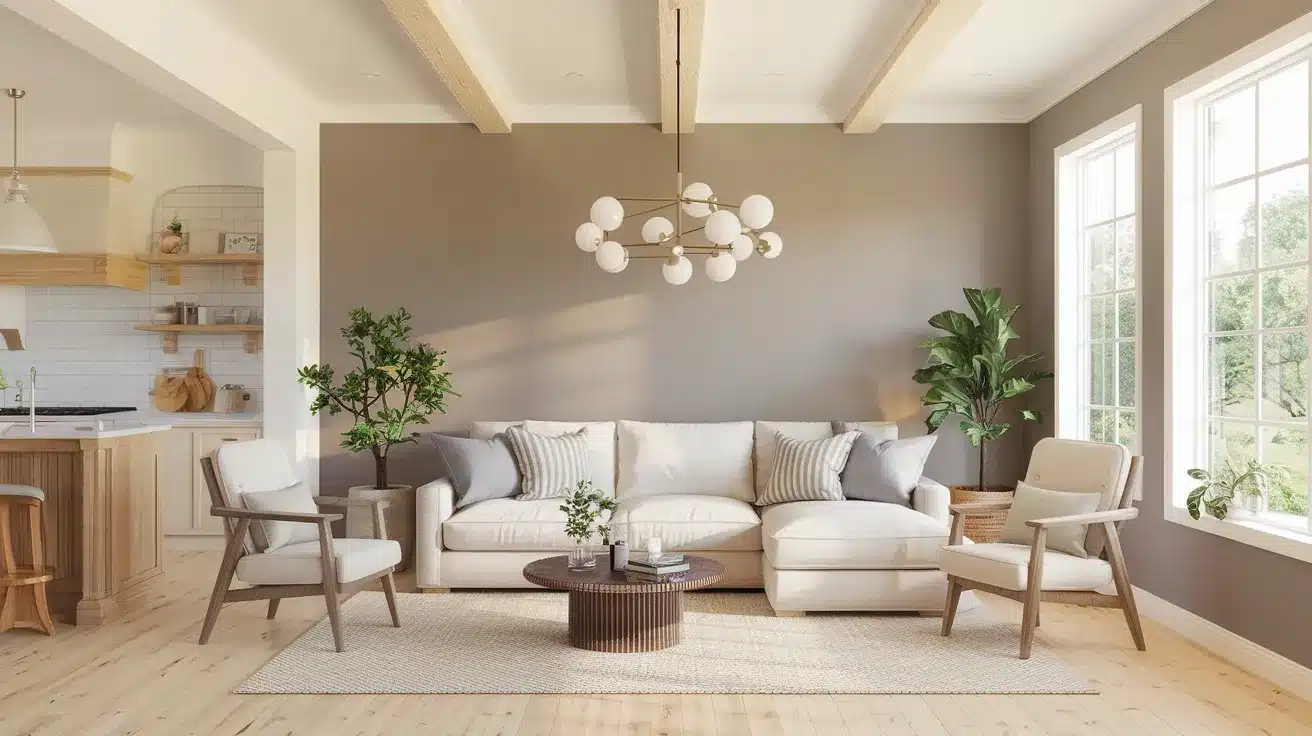
- Living rooms: Revere Pewter’s warm gray tones create a comfortable space for family time and guests.
- Kitchens: Revere Pewter hides small marks while keeping the space bright and fresh.
- Bedrooms: This color creates a calm feeling that’s perfect for rest.
- Home offices: Revere Pewter stays neutral enough to help you focus but warm enough to feel pleasant during long work hours.
Best Applications for Revere Pewter
This paint color does more than just walls.
It looks great on kitchen cabinets, giving them a modern but timeless look.
For doors, it adds a subtle touch that works with many color schemes.
In open-concept homes, it helps connect different areas smoothly – your kitchen, dining room, and living room can flow together naturally.
Just keep in mind that large spaces need good lighting to show off the color’s best features.
For exterior use, test a sample first – outdoor lighting can make the color appear quite different from the inside.
Conclusion
Getting the right paint color makes such a difference in how you feel at home.
Revere Pewter stands out because it adapts so well to different spaces – from busy family rooms to quiet bedrooms.
Its mix of warm gray with gentle green hints creates rooms that feel both fresh and comfortable.
Remember that good lighting helps bring out its best qualities, and pairing it with the right whites for trim and cabinets makes everything look pulled together.
Before you paint your whole room, try a sample on your wall first.
Watch how it changes from morning to evening – this simple step helps you feel confident about your choice and ensures you’ll love living with your new wall color.